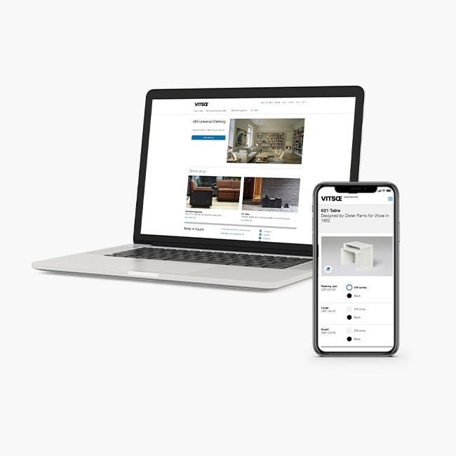
A luxury interface for a luxury product
See it live
About

Role
UX design, UI design, Front-end development, Information architecture, Product renders
Team
One senior developer, one junior developer, and myself.
Brief

Vitsoe relied on its physical retail spaces for most sales of the 620 chair and footstool. Online purchases were often preceded by a shop visit.
Business goals
- Increase sales of the 620 chair & footstool.
- Shift existing sales online.
- Reduce reliance on salespeople for sales by answering customer questions online.
- Update the interface to allow the addition of a new upholstery option.
Defining the problem

I started by looking for where the experience needed improvement.
Pain points
I collaborated with sales teams across the company to get an idea of what they were being asked, and why customers were choosing to order through them rather than online.
- The modularity of the chair was poorly understood.
- Customers expected the leather to be uniform, when in fact it had natural patterns/ scarring.
- Some customers were surprised by colour when they received the product.
- Customers couldn't buy a footstool on it's own.

This was what a customer was first presented with when they clicked 'configure and buy'.
Purchase journeys
Low sales meant it was practical to look at each purchase journey over a year long period.
- Most purchasers would spend weeks deliberating over their purchase, returning to the site many times.
- During this deliberation the gallery page was the most commonly visited.
- Users would 'play' with the colour configurations after viewing the gallery. It seemed like they were getting ideas for colour combinations from the gallery over the configurator.
- No purchases were made on mobile, but the gallery was popular.
User behaviour
- Most users were not interacting with the configuration options.
- Users that did configure the chair often stopped after adding an additional seat. - possibly because adding a seat drastically increases the price.
- Most users, even purchasers, would spend a very brief time on the informational pages accompanying the purchase page.
User Stories

Key points to address
- New product visualisations would be needed.
- Photography was needed for colour and texture decisions.
- The footstool should have it's own configuration page.
- The configurator needed to show the modularity, and customisation options of the chair without relying on other supporting pages.
- Adding additional seats should be the last part of any staged, or segmented purchase process.
Design

The user stories and research provided a clear list of features to be included in the new UI.
Product visualisation
Existing images on the buy page were the only product photography available. Business stakeholders were advised that new photography, or renders were required.
Our team created a quick proof of concept, in order to assess the practicality of a product spinner.

- Rendering 3D models in-browser couldn't achieve the quality we were looking for.
- Most libraries couldn't support the level of customisation we needed. Using React was the easiest way of building this functionality.
- There would be a lot of images for all the possible combinations, so optimisation would be crucial.
It was decided that renders would be preferable to photography, mainly for cost reasons.
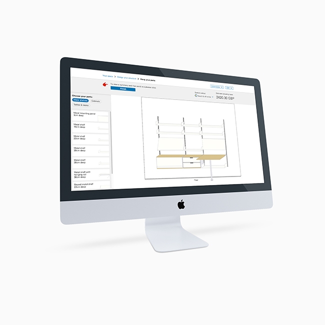
Initial wireframes


Staging the process was deemed too restrictive for users; it might stand in the way of customers understanding the modular nature of the product.
Condensing the controls was another option explored, this would allow the visualisation to be shown alongside the configuration controls.
Prototyping

Accordions were too small, and required a lot of scrolling. Using a scrollable area with a single accordion didn't improve any of this, but made it harder to scroll.
It became clear that a larger area should be available for the controls.

Switching between a configurator view, and a product view was a step in the right direction, but it still required the colour choice to be in an awkward dropdown list.

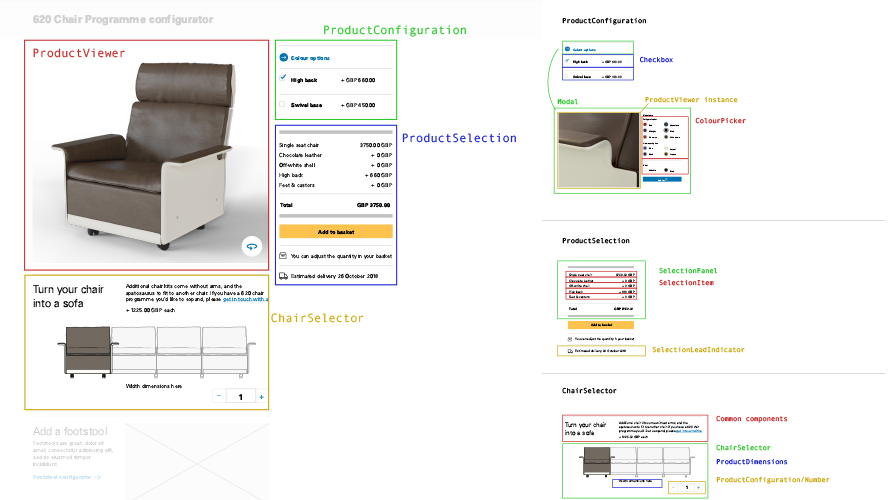
Splitting out the options into their own modal overlay was the best solution.
- All customisation options are shown to the user.
- The space gained using a fullscreen overlay could be used to include product photography.
- Showing this close up photography when selecting colour, would provide the user with much better material and texture information on the product.
- The modal buttons followed existing visual language used elsewhere on the site.
- Keeping the seat picker separate encouraged it to be used last, after other options had been explored.

The modal for colour choices was carried over to the desktop because of the advantage a close up photograph provided. Desktop offered additional space to include shell and upholstery colour in one modal.
This wasn't necessary for the back and feet options; it made more sense to represent these as addons, and use checkboxes.
Implementation

Now that the final design and major features were agreed, it was time to start building.
Technology
From the earlier prototype the team had agreed how the new configurator would be built.
- We would build it as a self-contained React app, and use typescript.
- It should scale to work on other configurable products in Vitsoe's range
- Images would be managed outside of the CMS
Data transport design

The structure we came up with described a product and contained all of the information our front-end would need.
Adaptive, data driven UI
The data structure dictates which component to render, for example any product with colour customisation would use the same colour picker component. This format could be scaled later to be used on any other vitsoe product.
Optimisation
From the earlier prototype we knew optimisation of the large number of images would be challenging.

Rendering out to multiple resolutions allowed me to implement lazy loading. With 16 images per rotation, loading these simultaneously took far too long. A custom implementation managed the order in which images loaded, as shown above.

This loading strategy was highly effective, users could interact with the spinner immediately after changing a customisation option. A small loading bar was added along the top of the frame so that users are aware images are loading.
For developers
If you have react devtools installed you can check out my component structure on the live site.
Testing

This round of usability testing was important for evaluating and finalising the spinner functionality.
Methodology
Starting from the home page of the site, participants were asked to buy specific configurations of chairs, footstools and sofas. After observing them complete the tasks, they were asked a few simple questions about the product.
Findings
Overall the feedback was very positive. Most users were quick to complete the tasks, and could answer the questions.
- One user completed the task without interacting with the spinner at all, not realising it was interactive. This resulted in the addition of the 3D icon in the lower left corner.
- During device testing on smaller devices; the confirm button in modals was not visible without scrolling. It was moved to the top of the overlay so that it would be consistent, and visible.
- The switch to the footstool in the top left was often mis-tapped on touch devices. Since the footstool was linked both on other pages, and beneath the chair configurator, we decided to remove this.
Further results
As the last project I completed at Vitsoe, I don't have the usual follow up data I would need to properly assess it. Therefore I've kept this write-up focused on the UI design and development of the configurator.
If you'd like to see an example of how I would usually measure the results of UX design changes, please check out the ecommerce UX study below.