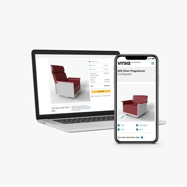
This proof of concept was part of a wider investigation into how Vitsoe could improve the purchase process for the 606 Shelving System.
See my presentation
Overview

Role
In this project I took on more of a product designer role.
Getting stuck into the development work where needed, and providing direction and design for the rest of the team.
Team
In addition to myself, the development team consisted of two senior developers, and a part-time intern.
Project Length
The project was scheduled for two weeks initially, but was extended to one month.
Brief

This prototype was part of an ongoing UX review of the sales process for the shelving system.
Background
Briefly: 606 is a modular shelving system. 'E-tracks' are directly attached to walls or posts. Various components such as shelves, tables, and cabinets are attached to tracks with pins.
The sales process was inquiry led, planners (salespeople) would design the shelving system on behalf of customers.

In-depth research on the sales process for 606 was ongoing. This included interviews with planners, behaviour analysis on the website, and sentiment analysis on the web inquiry form.
Pain points

- Planners wasted a lot of time providing quotes for customers that could not afford the system. Customers were often unwilling to provide their budget upfront.
- Planners found many customers who made inquiries didn't understand the basic concepts of the shelving system.
- Customers were hostile to the planning process. "Just let me buy it" was a common theme in customer feedback.
- Customers were being put off from buying into this modular system because components were not available to purchase online later.
An exercise in the possible
The idea of a customer facing drawing tool was far from a new idea within the business, but had been met with scepticism in the past. The key issue was that the various rules were viewed as too complex to implement in a web based tool.
Therefore, the main aim of this prototype was to prove that a sufficiently complex tool could be created to follow those rules.
Requirements
- System rules would need to be enforced; for example a table can only be attached at a specific height.
- Customers should be able to use the tool with no prior knowledge of the shelving system.
- Having used the tool, a customer should understand more about the system. It should be informative and educational.
- It needed to inform customers of prices.
Competitor tools

There was limited time to spend on this prototype, focusing on best practices from elsewhere was the most efficient way of understanding the UX/UI challenges involved.
Almost all of them were staged; allowing users to define the wall area first, pick tracks, and place components in separate stages.
After assessing many different tools, Ikea's Algot planner came out as an exemplar.

There were several key features which I recognised as UX design to learn from:
- Users can skip to step 3 by selecting from a list of templated examples. Giving them an immediate price, and promoting uses of the product a customer might not have considered.
- The interface is simple, and offers multiple ways for a user to complete a task. For example: the wall dimensions can be set by dragging handles, or by clicking on measurement labels and typing in a number.
- Measurements on the system visualisation can be toggled, providing important information without visual clutter.
- Contextual labels instruct users on the function of each UI element. These shake a couple of times to draw attention, and would disappear once the controls were used.
- Dynamic illustrations let users know what would fit on different shelves using relatable objects, rather than relying on measurements.
- Once complete, a unique shareable link was generated so that it could be shared with a partner or housemate.
Notes taken from other competitor tools:
- Providing total system dimensions removed the need for wall measurements entirely.
- Use of buttons to shift around components or structures was frustrating and repetitive.
- Colour should be selected separately to components; on the String planner a user would have to remove all the components to change the colour of their design.
Wireframing and design

The prototype evolved continually as we built it. Adding features in series to avoid leaving anything half finished.
Wireframes

One of our development team was remote, using Adobe XD it made it easy to share and keep updated with any changes I made.

The wall dimensions would be entered into simple inputs.

Using total system dimensions rather than measurements from walls, made placement much simpler. E-tracks would always be centered.
Requiring wall dimensions allowed tracks to be filtered down by height.

For this initial version, we would allow placement of the tracks anywhere. Tracks placed far away would snap to 90cm, and when placed closer would snap to 65cm width bays.
Some guidance was introduced here, making sure the user was unable to continue without at least one bay.

Adding a bay at a time was considered, but because there were multiple widths, it would require additional buttons on the active area. Using drag and drop for everything avoided additional complexity.

Again, components would be added to the bays with drag and drop functionality.
Components were split into three categories, and could be filtered with pills buttons.
We initially used colour coding to indicate whether a component would be allowed.
Minimum viable product
These mockups were light on detail, but by the end of the two weeks we had built this design and met all of the basic requirements. Using libraries for both the drag and drop functionality, and the rules engine saved us a lot of time.
Working closely with the development team was invaluable, wherever some aspect of the design was unclear I could quickly provide additional sketches on paper or on XD.
At this stage the prototype could validate E-track and component placement using a rules engine. It showed prices, used drag and drop, and allowed filtering of components by type.
Two week extension
With such great progress being shown, we were given another two weeks to work on it.
Since the core functionality was in place, features started to become more ambitious. In this second phase we would focus on the informative and educational aspects which were lacking in the initial version.
Additional features
- More guidance would be provided.
- Colour customisation (the shelving comes in 6 colours, up until now we'd only used white)
- An additional category for validation. Warnings would be included separately to errors.
- The option to switch to inches.
- Multiple currencies.
- Generate a unique shareable link.
Features such as multiple currencies and the shareable link were tasks given to our senior developers. They were able to get to work on these features without having to wait on further mockups or design direction.
This provided a bit of breathing space to put more thought into the UX of the tool.
Instruction messages

This header bar would be consistent across all stages, with one space for instructional messages.
Gamification
In games, mechanics are introduced early on that are then built upon later in the game. For example a gap in an early level can only be passed by jumping. In later levels the designer knows that the player understands how to jump, and can rely on this when adding in other mechanics and challenges.
Applying this concept to the tool, I ensured there was a consistent visual language for interactions.

This let the configurator build up complexity without over-reliance on instruction messages and hints, which are often overlooked by users.
Adding difficulty
In the first prototype the tracks could be snapped into bays from anywhere in the wall area. Even though this was much easier, it wasn't consistent with the components stage.

Reducing the snapping area to match the components section taught the user how to use the next section, where large snapping areas weren't practical.
Guarantees
To continue from the second section, a user must have created at least a single bay structure. So I could guarantee by the third stage:
- They had selected an item from the list. Learning blue meant selection.
- They had dragged and dropped a track into the drop target. Learning the function of the drop targets, and how to drag and drop.
- They had seen the colour change from red to unshaded as they dragged it into the drop target. Learning that the illustration changes colour when placed correctly.
It was much easier to learn this in the second stage, because the third stage would be introducing much more complexity. There were more components to choose from, many more drop targets, and now there would be more rules to follow too.
Contextual labels & instructions
Instruction messages would update after every step of the process was completed. These would always remain in the same place on the screen, and the pointing hand would animate when a new message appeared.

To teach the user about the system, contextual labels would be used to explain when rules were being broken.

Warnings would tell users when they were making choices that were not recommended by a salesperson.

Errors would tell users when their placement was invalid, and explain why.
The tooltips followed the same colour scheme as the other interactions. They are first introduced in the wall dimensions page, so their purpose should be understood before adding any of the components.
Outcomes

The tool was received well by the company.
Long term plans
The tool proved the point we wished to make; a web-based planning tool could be sufficiently complex, and follow as many rules as necessary. It also showed that it was within the reach of even a small development team.
This project, along with research I carried out, provided the impetus for the company to re-prioritise crucial digital infrastructure work which is still ongoing at time of writing. Eventually this will provide the framework to support a tool such as this.