Improving sales for the 621 table involved changes across the website and digital marketing.
See it live
About

Role:
UX research and design, front-end development.
Brief

As Vitsoe's most accessibly priced product, the 621 table is a gateway product that aims to encourage further sales.
Business objectives
Improve online sales, specifically focusing on the 621 table.
Research

One of the first things I implemented when starting out at Vitsoe were google analytics, and custom events tracking.
Resources
Four months before starting this project I had set up custom event tracking for things like product customisation, videos and galleries.
My window to the customer was via the sales team; wherever possible I used them to better understand customer motivations and frustrations.
Personas

The UX personas I created involved a lot of collaboration with the most experienced Vitsoe salespeople, along with website usage data.

These were representative of both Vitsoe's existing customer base, and their target market. I could then adapt these base personas where needed for a specific project.
Awareness
There were few pain points directly associated with the website. The biggest problem that became immediately apparent was a lack of awareness. Even long standing Vitsoe customers were unaware that there was an online shop.
Dieter Rams
Large portions of the website are taken up with the career, history and philosophy of the designer's work. These pages were ranked at the top of search engines for 'Dieter Rams', driving 25% of all traffic to the site. However, the vast majority of this traffic appeared to be students copy-pasting his 10 principles of design, and very few entrances to these pages visited the rest of the website.
Vitsoe Voice
The company also has its own publication 'Vitsoe voice'; a collection of lifestyle and design articles. Many featured Vitsoe products, but they would more often feature interesting customers, or Rams' design philosophy.

As shown here, the publication took pride of place on the homepage; obscuring the visibility of Vitsoe's products.
When I looked into readership, I found most were existing customers arriving via email newsletters; only 4% of readers arrived from the homepage.
Conflicting business goals
Website usage showed Rams pages were driving traffic but not sales. The editorial was more successful at improving sales, but only when articles mentioned products specifically.
Both of these built up the impression that Vitsoe was a design publication, and informational site for Dieter Rams' legacy.
Discussions with business owners and the marketing team confronted the issue: the website needed a clear purpose. It was agreed that the website should be first and foremost a selling tool, with editorials and the Rams pages supporting that purpose.
Shopping behaviour
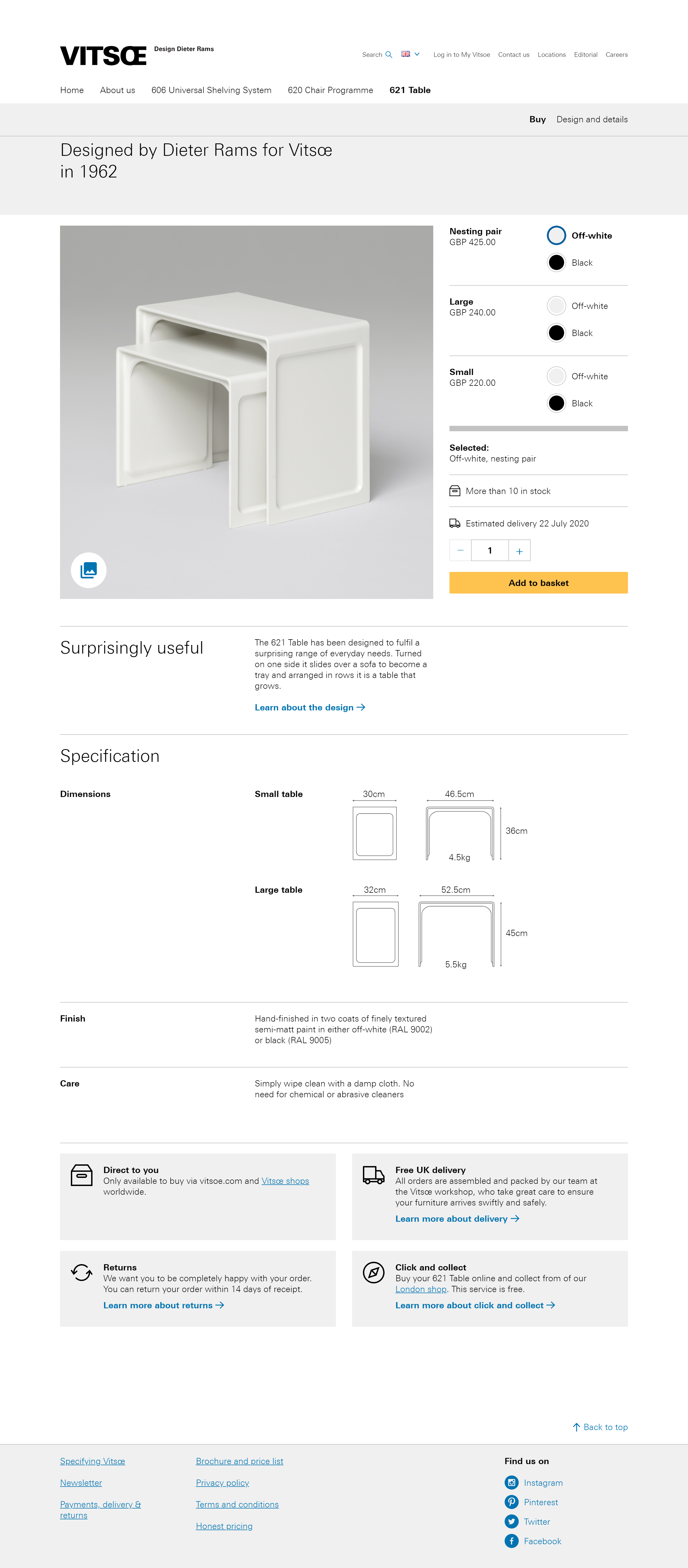
The 621 table area of the site was split into four pages. This seemed to be a microcosm of the broader issues the website faced.

- Few users advanced beyond the introduction page
- The introduction page contained a list of prices for the tables, but no obvious way of buying them.
- Prominent links took users away from the 621 area entirely, back to pages about Dieter's career, and the good design principles.
- The pages were heavy on text but lacking substance on the product itself.
- Overall just 9% of users who reached one of the other 621 pages ever reached the buy page.
- On the buy page, 90% of users would interact with one of the customisation controls.
The key issue seemed to be getting users to reach the purchase page.
Key issues
- The homepage was too focused on Vitsoe voice
- Vitsoe voice needed to focus more on the product
- The online shop needed to become the focus of the website
- There was too much content in the way of the purchase pages
Design

A lot of my design work was focused outside of the 621 product pages.
Making the product centre of attention
The deeper issue with the perception of the site was the first thing I needed to address.

This proposed layout simply shifted elements around, meaning it carried a low development cost.
- Products were moved to the top of the homepage, with 606 taking pride of place as Vitsoe's most important product.
- Vitsoe Voice was moved to the end, and the large featured article was removed entirely.
- 'Our furniture' was changed to 'Online shop'.
- Links were changed from 'read more' to 'Buy online' or 'Configure and buy'.
- Links for products were pointed at purchase pages, rather than introduction pages.
- Social media links were added for instagram, and pinterest, as I found these were popular among converters.
Working with marketing
The marketing team was provided with a dashboard in Google Data Studio to help them measure how effective their newsletters, social media, and articles were. Instagram was found to be the most effective social media platform, and they began focusing more effort there.
Fixing the user flow

Essentially my strategy was to simplify, following Dieter's own rules, and anything that didn't support the purpose of these pages was removed.
I was able to eliminate one page entirely, since the introduction page and design history page contained mostly duplicate information.
I also changed the order these pages would appear; making /621 the purchasing page, and 'Design and details' page second.
This would let users see that the table was available for online purchase, it's price, and what it looked like first. They could then choose to read further about the history and design of the product.
Gallery content
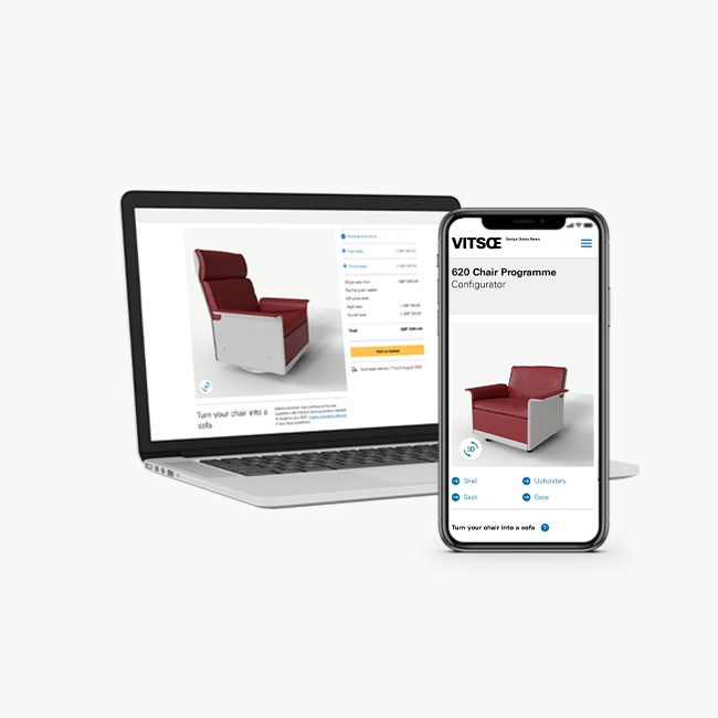
The galleries were important for building aspiration, and also played a role in the 621's gateway strategy. Gallery images for the table often featured other Vitsoe products.
All the gallery pages at the time displayed images in a list view, but they also had a fullscreen gallery lightbox which allowed users to scroll through the content. Event tracking showed the lightbox was the preferred method of navigating through them.

Inserting the existing functionality of the lightbox into the purchase page would make the images more accessible, and remove another lengthy page.
I had wireframed some layouts for this on paper; the key decision was whether I could use the existing product image to open the lightbox, or whether it needed to be a separate UI element.
If it were available I'd have liked to use A/B testing here, but I had to choose now, and measure later. I decided to use the existing product image for the lightbox but I was aware this was a risky decision.
My main concern was that even with good iconography and labeling, a user would reasonably expect a lightbox to open larger versions of the studio photography.
Another smaller change here was to make the product image landscape on mobile, and square on desktop.
Using a 16:9 ratio on mobile gave more space for the controls to be seen by a user, without the need to scroll up and down the page.
Follow up

Looking at behaviour is often more important than sales.
Sales
There were 46% more unique purchases, with a 25% increase in the number of tables sold in the year following the launch of these changes.
The shift towards social media may have had a more significant impact. For this reason checking behaviour is often a better measure of UX changes.
Behaviour changes
Comparing the four months either side of the homepage and 621 area changes being launched:
- Vitsoe Voice readership was slightly higher. As it was mostly being read by existing customers moving it further down the page did not damage readership.
- Navigation from the homepage to product pages increased by 2%. In raw numbers this accounted for an additional ~4,000 pageviews.
- Views for the 621 purchase page increased by 535%.
- Far fewer users reached the details page, but those that did, were more likely to buy.
- Those that did reach the details page, spent longer here on average. Showing that this information was easier to digest in the new, condensed form.
Galleries
In the four months before and after launching the changes there were 9,780 unique events for opening the gallery, vs 1,254 unique pageviews for the old gallery page. An increase of 780%.
Excluding those that bounced, 95% of users opened the gallery lightbox.